May 2025
Journey to Folio
What I Learned from Building (and Rebuilding) My Portfolio
Web portfolios are a great way to showcase your work, especially as a front-end developer. A well-built landing page immediately reveals key aspects such as UI quality, content hierarchy, and fluidity.
The main challenge in creating my portfolio was building an interface that met my expectations. Since I initially had only basic knowledge of UI, looking for visual references was a good starting point. But to develop something more authentic, a deeper understanding of design is essential.
Starting Point: Expectations
I believe one of the biggest challenges for front-end developers when creating portfolios or personal projects is occupying an in-between position: we are, in a way, a bridge between the back end and UI/UX design.
On one side, we need some understanding of back-end concepts, especially with the rise of front-end concepts like Server-Side Rendering and Server Components. On the other, it’s essential to understand UX/UI fundamentals to deliver a good visual and accessible experience.
We also need to deal with concepts like browser compatibility, DOM manipulation, and a vast ecosystem of frameworks (React, Next.js, Vue, Angular), among others. This can be frustrating, like falling into Alice’s rabbit hole, or motivating, since there’s always something new to learn.
First Version
With that in mind, I wanted to design the UI myself in my first portfolio version. I started collecting references online that aligned with what I had in mind.
The first version used a basic color palette: black, white, and green. My idea was to aim for an underground, Matrix-inspired aesthetic, reminiscent of old-school terminal interfaces.
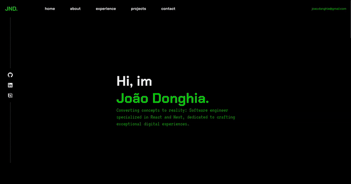
The result was decent, but I made typical beginner design mistakes:
- Lack of color harmony
- Unresolved typography
- Responsiveness issues
Second Version
I began looking into other approaches: 3D Rendering and Motions. I discovered some websites that apply these concepts really well, such as the official Genshin Impact website, which uses GSAP and Three.js, both popular and well-established libraries. So, I started studying and applying them in some practical projects.
The result was acceptable from a creative standpoint, I was able to externalize many ideas that had been stuck in my head. However, I ran into new issues:
- Too much information on the screen
- Motion effects everywhere
- Difficulty maintaining a semantic layout on smaller screens
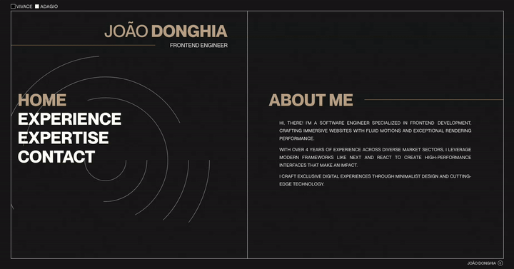
Third Version
I learned from the mistakes of previous versions and aimed to resolve them in this one.
The result was really solid. This time, I adopted a more minimalist approach with:
- Clear visual hierarchy
- Responsive and adaptive layout
- Well-defined spacing and typography
What About the Content?
The visuals were finally solid, but then came another challenge: content. How could I present my projects and professional experience?
Most of the work I’d done was for internal projects, which meant I didn’t have access to screenshots or public links. That’s when I had the idea to showcase my work through articles.
It’s challenging to write engaging articles without practical or visual material. Plus, how do you write without exposing sensitive information? After a few attempts, I found a format that worked well. In the process, I learned a lot.
Conclusion
I still maintain and improve the last version, constantly applying new ideas as they come up.
Creating a portfolio requires patience and consistency, especially if you want something authentic. The process can be frustrating at times, but it leads to meaningful and rewarding results.